Ecommerce Microcopy and CTA’s: Getting it write
Ecommerce microcopy and calls to actions (CTA’s) are so often overlooked in the process of writing copy for an online store. Although ecommerce microcopy is so small and seemingly insignificant, it is actually vital to a smooth user journey. CTA’s are often in the form of a button and they guide users in the action you require from them next. Here is a good explanation from Hubspot into what a CTA is.
Ecommerce microcopy is your chance to speak to and engage with your shoppers. You get to delight them with your clever little details. Show them your brand personality – be the guiding fairy in the sometimes scary world of online shopping. Why would you let that opportunity pass by using whatever copy comes with the online store solution you are using? Or worse still, allow your developer to just “put something in”?
Let us look at one ‘micro’ example of microcopy on an ecommerce store:
A field asks a user for their phone number.
The ecommerce microcopy within the text field reads “+27 11 123 4567”.
The tool tip given says “Please supply the contact number you can be reached on regarding your delivery. Your delivery date and time will be sent to you and the courier may need to call you to confirm. We will keep your number to ourselves, we promise.”
If the field is not completed, the error message reads “Please supply number in format +27 11 123 4567. Numbers with an international dialing code will not be accepted”
That is quite a bit of work to just gather a users phone number, but that could be the make or break difference in gaining a lifelong customer. The effort is worth it.
5 examples of ecommerce microcopy you need to focus on and ensure you are using to their full potential
1. Billing and shipping address forms
Users are increasingly wary of providing personal information and for good reason. Leaked or sold data can land you on contact lists resulting in unwanted calls and messages. Therefore providing personal information other than just a contact number (eg. physical address, birth date etc) can become a security risk. This is your biggest battle when asking your shopper for personal information. However your ecommerce microcopy can be the voice of comfort and guidance. Write your microcopy to clearly explain why you are asking for certain information. Explain what you will be doing with the information and how it will be used in future. If your microcopy has done its job your shopper will be more likely to provide you with the information you need. You can also ensure you have links to your privacy policy to allow shoppers quick and easy access should they have any further concerns.
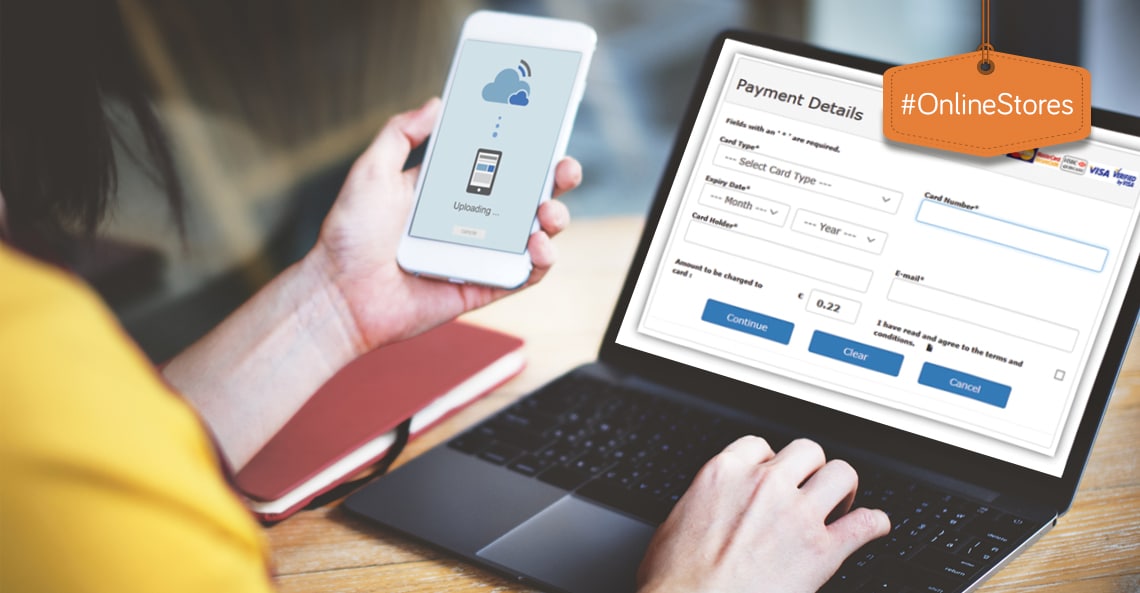
2. Security information and payment forms
The next fear barrier is the payment form and the question of security. Here it is vital you use microcopy within form fields, around your form and even in tooltips to reassure your shoppers that the checkout process is secure and trustworthy. In this section you want to give your shopper payment options where possible to allow them to choose the method they trust. Using payment portal logos, telling users if their credit card information will be saved or not and explaining any redirects they can expect from their bank etc all help in guiding your users through the experience of paying online. Iconography such as locks and shields are popular choices to reinforce the safety of a user’s information.
3. Error messages
Error messages often come default with a theme or plugin and are therefore often left as generic text such as “error”. This means that the same message is shown in multiple instances and your shopper is still left clueless as to why they cannot proceed to the next step. Writing specific error messages for your users for each area in which an error can occur will allow them to easily fix the problem and move on quickly without becoming frustrated. Well written microcopy can often reduce the number of error messages received in the first place, but that doesn’t negate their importance.
4. Shopping cart pages
Taxes and delivery costs at the end of a checkout, even if expected, can become a frustration for shoppers. Adding a small tool tip to explain these costs can alleviate the annoyance. If delivery is free, you can use a tooltip to offer another type of delivery which may suit a person better. Your shopping cart can become a wealth of information to your shopper, allowing to get all the relevant information around security, delivery, payment options and other products all within one page.
5. Click triggers
Click triggers work in conjunction with your buttons. They are enticing bits of copy that prompt a user to carry on with the process. This could be a reminder of your secure-checkout process, a prompt offering a free trial, a promise of a 30-day money back guarantee etc. These pieces of ecommerce microcopy can be very sales driven. They are not links in themselves, but rather entice a shopper to continue down the purchase funnel. They can appear in close proximity to the action button, or they can be placed strategically around your website.
When writing your ecommerce microcopy, think through the following questions:
- Educational – is it educational?
- Useful – is it useful?
- Clear – is it clear?
- Does it delight?


Dealing with ecommerce CTA’s
As your shoppers become more online shopping savvy, they have learned so many things which guide their online spending decisions. There is a universally accepted collection of buttons and CTA’s which your shoppers expect and more importantly trust. This is not something you want to mess with. Yes, your brilliant copywriter can think of all sorts of quirky creative lines to liven up your store. However quirky can be confusing. And scary. For that reason rather stick to the more conventional button copy when dealing with the user shopping experience. These include:
- Add to cart
- Checkout
- Proceed to checkout
- Proceed to payment
- Checkout now
- Continue shopping
- Order and Pay
- Pay now
- Proceed to secure checkout
You can have a look at the wording on websites you trust to quickly get a good idea of these generic buttons and words which have become part of the ecommerce dictionary of trusted terms.
Flicker Leap specialise in creating user experiences which convert. We look at the full spectrum from the big picture of choosing the over arching technologies to get your ecommerce solution up and running down to the finer details of microcopy and CTA’s. Contact us if you are looking for help with the macro or the micro details of your online store or website.
If this was helpful, have a look at Online store copywriting tips to make more sales to get some help with your overall ecommerce website copywriting.


This Post Has 0 Comments