Answer 3 questions to create a basic CI design document
A basic CI design document will form the base of how your logo and brand are applied. As your brand develops and evolves, you will make tweaks and changes and add new and exciting ways of applying your original concept. They can become very long and complicated manuals, but that is not how they start off.
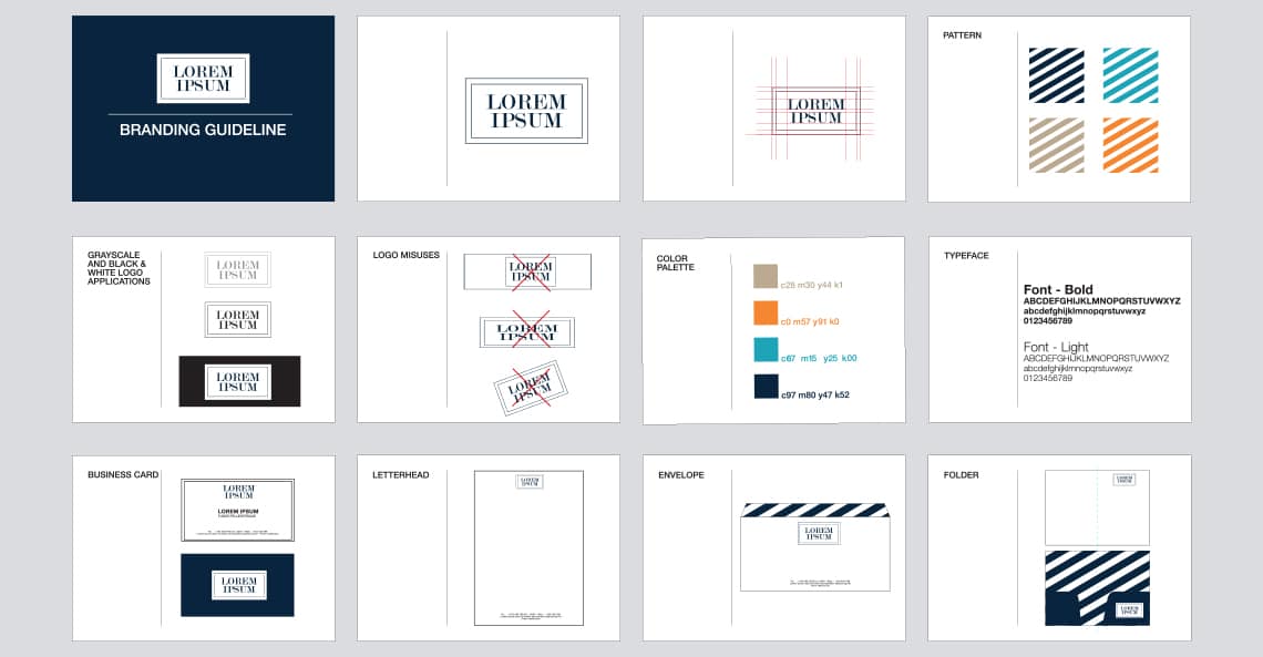
There are 3 questions you will need to answer to create your basic CI design document:
1. How is my logo applied and used?
The key here is to illustrate the best way to showcase your logo and to visually represent how your logo looks in different formats. This section will look at how the logo looks on a black versus a white background. It may include how your logo looks if it is printed in a single colour or embossed into wood, or show how a holding shape is used around your logo when it is applied on a very busy background. This section can also include some rules for your logo. For example, maybe you don’t want your logo to ever be used on a red background and you would never want your logo to be distorted, stretched or with the elements reconfigured. You can specify as much or as little as you choose to guide how your logo is applied.
2. What are my brand colours?
You will need to get the exact colour codes from your designer to ensure that your brand is consistent across both print and digital media. The colour codes you will need are:
- CMYK colour value (used for print media)
- Pantone colour value (usually used if you are printing a single/two colour element or if you are printing signage or if you’re printing on another specialised media, such as a t-shirt)
- RGB colour value (used for digital marketing elements, your website and for PowerPoint presentations)
- Hex code (used for digital marketing elements and websites)
- If your brand has any other colours, which are not necessarily in your logo, but which you intend to use as part of your branding, you can add these colour codes too.
3. What fonts go with my logo?
There are a variety of free fonts available for Mac and PC today, many of which come in multiple font weights, so you have a wide variety to choose from. Your fonts do not need to be the exact font used in your logo (actually, we suggest you don’t use your exact logo font). Choose one or maximum of two fonts that you will use on your marketing material. We suggest having a look at the Google Fonts library as you can easily use them on both print and digital media, including your website. Since a “custom” font will require the user to load it onto their computer, it is always wise to also select a “basic” Windows font, which the majority of people will have on their computer by default, for your digital communications such as emails, letterhead templates, PowerPoint documents, etc. (Wikipedia has a list of the default Windows fonts)
With these branding basics set, you can get cracking on creating your marketing material and website. As you go, add to your basic CI design document to keep a record of how you have applied your brand. A basic CI design document is only successful if it is used consistently (find out why a CI document is important in this previous article), so stick to your guns! Be a stickler for the details and brand recognition will follow.


This Post Has 0 Comments