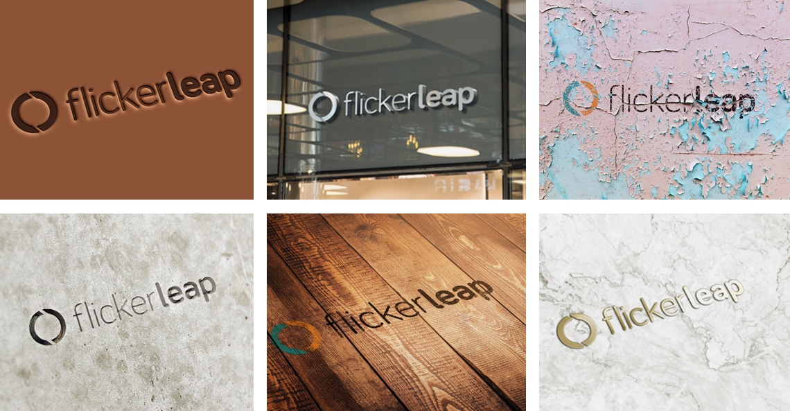
How to make logos work across different applications
It is always so exciting to see your logo in ‘real life’, printed and applied across a range of mediums. The problem is that sometimes a logo looks great at the size it is created at, but a little bit off when it is used on different media. Generally, you will have the full-colour version of your logo and a single-colour application, but this is not always enough. Here’s how to make logos work across some different applications.
5 applications where you need to make logos work
1. Very small, single-colour logo applications
Pens are the usual suspects in this category. You will generally have a very small, long and thin area you are able to print on. For this application, a text-only, horizontal version of your logo is ideal.
2. Large applications with simplified/single colour
Signage applications often have strict print specifications. Vinyl, laser cut materials, lightboxes and even billboards can change how your logo looks. Consider a version of your logo with a holding shape to allow for some flexibility. It can also be helpful to create a simplified or flat icon version of any graphics which are part of your logo.
3. Digital media
Horizontal logos have become the dominant orientation for website applications as they lend themselves to both landscape (computer/laptop) and portrait (mobile phone) screens. Due to resolution and the size of your logo on your website, it may be best to have a version of your logo without a payoff line attached, or even where the size/position of your payoff line is altered to promote legibility. Also, removing your payoff line from the logo image and building it into your website text can ensure it is legible no matter the screen size and it will also help you with your SEO content. You can also look at an icon version of your font to use as a favicon (an icon associated with a particular website, typically displayed in the address bar of a browser accessing the site or next to the site name in a user’s list of bookmarks) for your website.
4. Social platforms
You need a social media presence and different platforms require different applications of your logo. Many social platforms need either a square or a circular profile picture. For this, you can create a rearranged version of your logo or make use of elements of your logo to create your profile image. Here is our favourite cheat sheet for the various social platforms.
5. Branded items and print techniques
The advancement of printers over the last few years has allowed companies to brand anything from t-shirts and caps to stress balls and fidget spinners, and everything in between. This introduces a variety of print techniques. Embroidery, screen printing, sublimation, etching, laser cutting, etc. Embroidery will not allow very small text, so it is worth looking at an option where your text and image are a similar size. Some print applications are charged per colour, so consider creating a two, or even three, colour version of your logo to cut costs while still including a pop of colour.
By creating a library of the different applications of your logo upfront will help you to form a unified brand image and avoid the various ad hoc logo versions brands can ultimately end up with.
Now it’s time to make logos work across all your different applications. Go get yourself branded!

This Post Has 0 Comments