
Don’t go yet! Ecommerce checkout design that converts
A well-designed ecommerce website will guide users to the all-important checkout page to convert their sale. You don’t want to be shouting “Don’t go yet!” to an almost customer because of a poorly considered checkout design. By altering the custom settings and considering a few easy tweaks, you can ensure your ecommerce checkout converts the maximum number of sales. An awesome checkout page will not make-up for poorly-designed ecommerce website or product pages. The two previous articles in this series ‘Checklist for effective ecommerce product page design’ and ‘Basic principles for effective ecommerce website design’ will give you some guidance for designing these. But now, let’s take a look at ecommerce checkout design that converts into sales.
Ecommerce checkout design that converts
Cart Summaries
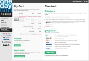
When it comes to ecommerce checkout design that converts, cart summaries are super important! Think of this as your digital shopping cart which you might want to have a look at before you actually go to the teller to pay. Ideally, it would be quickly accessible from an icon/menu and shown as a full stand-alone page. Cart overviews allow visitors to continue shopping while knowing how much their order is going to cost them and then navigate to the checkout process. Ecommerce cart summaries allow users to modify their purchases (change quantities, move products to wishlists, etc.) and allow you to market ‘add on’ products to them. Hidden costs are one of the main reason people abandon their carts so make sure that the total cost is a true reflection of what they are in for.
Is one page the way to go?
There is much debate around the one-page checkout process. Ecommerce checkout pages are not a one size fits all solution and need to be designed and tested to convert successfully. One-page checkouts are often cluttered and confusing and can easily lead to cart abandonment. Often a better approach is to create a short, logical stepped process allowing shoppers to see where they are in the process and understand how much longer the checkout process is going to take them. Either way, your checkout page needs to have an organised flow to successfully convert.
Information gathering tactics
Forms are boring. So be clever with your information gathering so you don’t overwhelm your visitor. Here are a few things to consider:
- Remove all distractions on your forms – no upsells, no testimonials, no social sharing.
- Supply info buttons on sensitive content such as phone numbers (eg. We need your phone number so we can contact you if we have any questions about your order)
- Use the minimum amount of fields and simplify the inputs.
- Auto-populate fields where possible.
- Create interactive forms to hide fields until they are required
Getting that all-important email address
Forcing customers to create an account early on in the checkout process can scare them away. You will need to find the optimal time to ask for such a valued piece of information from your visitors, which is where the testing comes in. Popular online store One Day Only forces login upfront, but allows multiple signup options. This login process allows them to make use of a one-page checkout.
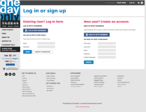
Best practice is to allow customers at least three options: checkout as a guest; log in to an existing account; or create an account. Guest checkouts cater for the impulse shopper who might just return to your store should the experience delight them.
So how should my ecommerce checkout design look?
That is easy. The same as the rest of your store. Online shopping can be daunting and your job is to prove you are a trustworthy place to spend money. Your brand personality should carry through to all pages of your Ecommerce website. Show security seals and credit card/payment gateway logos to promote trust. Make sure shoppers can easily access information such as returns policies, shipping policies, FAQ’s and customer service.
So long, and thanks for all the fish
A successful sale – well done! But your job is not done. Your customer might still be a little weary, so let them know the next steps. This could include the delivery date, instructions on how to download a virtual product and maybe even some contact details. You should treat your thank you page as the first page for your next sale. You can encourage shoppers to share their purchase on their social platforms, recommend other products and even encourage guest shoppers to create an account to better track their purchases or to store their information for their next purchase.
Ecommerce checkout pages that convert are the result of testing, changing and monitoring until you have a design solution that your shoppers are happy with and cart abandonment numbers are low. And there are many more lessons to learn in optimising your checkout process.
At Flicker Leap, we love ecommerce and all the possibilities it creates for businesses. Let’s discuss an ecommerce solution, and particularly an ecommerce checkout design, that will suit your brand.


This Post Has 0 Comments